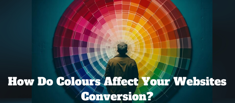
Every color is associated with different emotions. The use of color in design can affect the
emotions and moods of the people viewing those color palettes. Using colors wisely can
improve user experience and increase desired behaviors (including conversion rates) in
significant ways.
The psychology of color in web design plays a crucial role in influencing user behavior,
emotions, and perceptions. Color choices can impact how visitors perceive a website, affect
their mood, and even influence their decisions. Here’s a breakdown of how different colors
are perceived and their potential effects:
- Red:
Emotion: Red is associated with passion, excitement, and love. It can also evoke a
sense of urgency.
Use cases: It’s often used for call-to-action buttons to grab attention and encourage
action. However, it should be used sparingly as it can be overwhelming. - Blue:
Emotion: Blue conveys trust, stability, and professionalism. Lighter blues can create
a sense of calm, while darker blues can be more authoritative.
Use cases: It’s commonly used in corporate websites and social media platforms. - Green:
Emotion: Green is associated with nature, growth, and health. It can create a feeling
of relaxation.
Use cases: Commonly used by eco-friendly brands and websites related to health or
well-being. - Yellow:
Emotion: Yellow represents optimism, happiness, and energy. It can grab attention
but may also be associated with caution.
Use cases: Often used for highlights and call-to-action buttons, but too much yellow
can be overwhelming. - Orange:
Emotion: Orange combines the energy of red with the cheerfulness of yellow. It’s
often seen as a fun and vibrant color.
Use cases: It’s used by many e-commerce sites to create a sense of enthusiasm and
motivation. - Purple:
Emotion: Purple represents luxury, creativity, and wisdom. It’s often used in brands
that want to convey sophistication.
Use cases: Frequently used in beauty and creative industries. - Black:
Emotion: Black symbolizes sophistication, elegance, and power. It can also
represent mystery and depth.
Use cases: Common in luxury brands and high-end products. - White:
Emotion: White is associated with purity, simplicity, and cleanliness. It creates a
sense of spaciousness and can be very calming.
Use cases: Often used in minimalist and clean designs, as well as medical and tech
websites.
- Gray:
Emotion: Gray represents neutrality and balance. It can convey a sense of
professionalism and formality.
Use cases: Often used in conjunction with other colors to create a balanced design. - Brown:
Emotion: Brown represents earthiness and reliability. It can evoke a feeling of
warmth and comfort.
Use cases: Commonly used in websites related to food, agriculture, and natural
products.
When using colors in web design, it’s essential to consider your target audience, the
message you want to convey, and the context in which the colors will be used. A well-
thought-out color scheme can enhance the user experience, reinforce your brand identity,
and increase engagement, while a poorly chosen color palette can have the opposite effect.
It’s often a good idea to conduct A/B testing to see how different color choices affect user
behavior and adjust your design accordingly.


